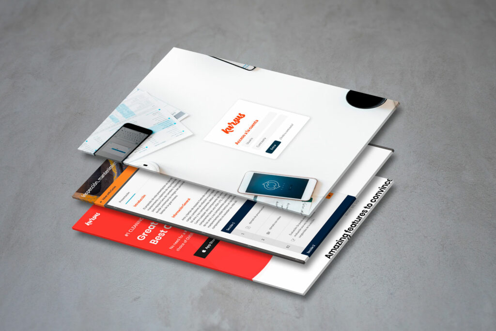
Kursus is an e-learning intranet platform, specially created and designed for a Mining company, to help them train labour and staff in different areas of the industry such as the use of tools, self-protection, and company security rules.
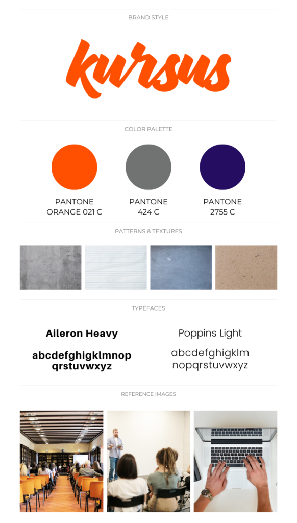
One of the specifications in the brief was the user: most of them are non-tech savvy. Considering this it was a challenge for us to design for them a platform easy to use and easy to follow the steps of a course system. To make this possible, we choose a reduced color palette, organize the information in an easy and natural way to navigate. Also, we include a review forum to listen to the users in the first launch, to make it better.


