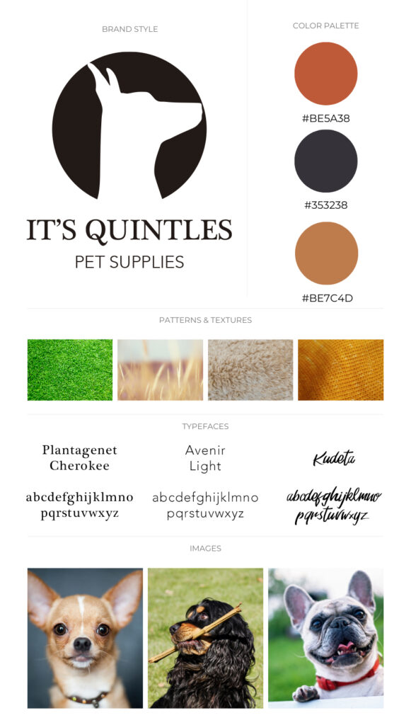
As a graphic designer, I worked closely with the owner of a pet supplies company to develop the concept and branding for his business. The client wanted his brand to reflect his Mexican roots and spirit. Through our collaboration, we came up with the idea of using an original and special kind of Mexican dog, the Xoloitzcuintle, as the basis for the brand identity.
During a brainstorming session with the client, the name “It’s Quintles” emerged and resonated with him. The brand name perfectly captures the essence of the Xoloitzcuintle while also being catchy and memorable.
To further bring the brand to life, I created a logo featuring a stylized Xoloitzcuintle dog, using bold and vibrant colors that reflect the client’s culture. The logo is now used across all of the company’s marketing materials, from product packaging to social media graphics, and has helped to establish It’s Quintles as a unique and memorable brand in the pet supplies industry.